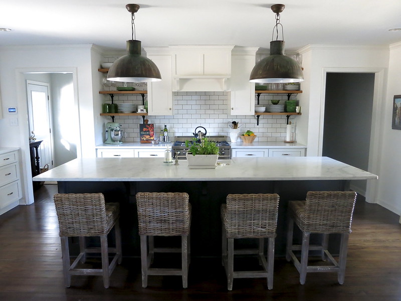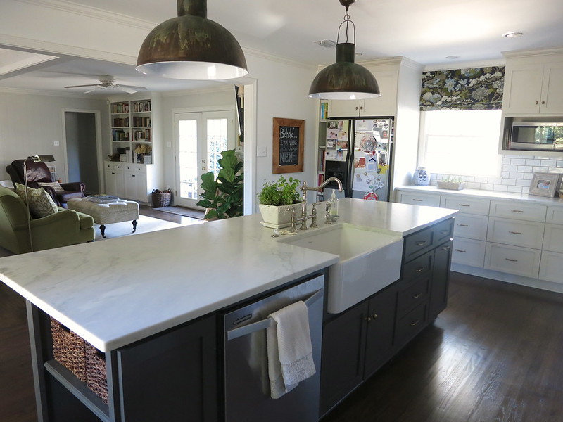
is so good.
I don't think I have ever seen a kitchen renovation that is more me than this one. I even have one of those lights in my dining room! It's exactly the feel I'm looking for once we decide to take the renovation leap.

We haven't gotten our thoughts together enough to do any kitchen reno planning at our new house but this one sure comes close to what I imagine the finished product would look like. I love all of the materials and finishes. The cabinetry - the mix of dark gray and off-white, as well as the simple shaker style. Of course the subway tile and marble counters are my first choice.
You can check out the full details about this kitchen on Create Live Design.
so Meg

Gosh, this kitchen really is perfection. Love the contrast of white and dark, with some warm woods mixed in. So great!!
ReplyDeleteAlso - so happy you're back to blogging, and congrats on your new job! :)
This is really something to worth looking forward to. It’s very bright, has enough storage areas, and big enough for your family. It may require a lot of work, but it’s still a score. A hiring a pro or consulting someone you know will be of great help to make the work lighter.
ReplyDeleteDavid