The other important thing for us to think about, other than how the renovated space will function, is how it will look. We definitely want a comfortable, casual space that our friends and family can feel good in. We want it to be organized and welcoming. We want to hang art that means something to us and we generally want the vibe to be pretty relaxed. Jay and I both love a neutral shell with hits of personality and a little colour. We love re-purposed farmhouse style... just a little more refined. I'm not sure if that makes sense. Maybe the closest description would be 'modern farmhouse style'.
Here's a sample of some of the finishes we're looking at for the kitchen in our home.
1. I love the soft grey of this cabinetry and simple hood vent over the range. This space contains a lot of the elements we love for our kitchen. Especially the general feel - casual and family-friendly, but still a little refined. Via
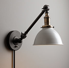
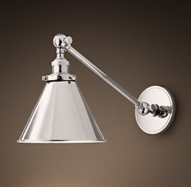
2. We chose this light to go over the sink in our kitchen... I think. I feel really stuck on this decision. One part of me likes this oil-rubbed bronze with brass finish, and the other part of me wants polished nickel. The light comes in two finishes and will be hard-wired. If we go with the nickel, the hardware and bracket choices will also change. Via
 |
| There's also this version which dreams are made of. |
3. We already have this light in our dining space now. We'll be keeping it and hanging it over our new banquette. Spoiler alert: there is a banquette in our new space. This light is one of the main reasons I've been looking at oil-rubbed bronze for our hardware finishes as well. It was ordered from Wayfair.com a few years ago.
4. Decisions, decisions. I've been reading up on counter-top options including carerra, quartz, caesarstone, etc. I want the counters to read more as white with veining, not gray, since the cabinets are gray and I'd like to see some contrast.
5. I will be testing out some paint colours this weekend to try and begin to narrow down the colour selection. BM Gray Owl is currently the front-runner, but I'll wait to see the colour painted in the room before I make a final decision.
6. Brackets to hold up our barn wood shelves. Jay will be making the shelves out of some salvaged lumber we have. I love the warmth this will add to the space. Still feeling torn about the oil-rubbed bronze finishes. Via
7. A great example of salvaged wood shelves that I think are done really well. (I think these are from the 'Our Vintage Home Love' blog.
8. The hardware I love from Schoolhouse Electric. Doesn't come in polished nickel. Really wish it did. I love this hardware and want the hex pulls hard.
9. These chairs are perfect to blend our farmhouse modern look with the mid-century style of our little ranch. Now that Wayfair is accessible to us Canadians (YAY!), I will most likely order their version since the Cassandra chair is only $249.99 CAD/pair.
 |
| The shiny metal version for reference. |
So there you have it. Any thoughts on the polished nickel versus oil-rubbed bronze debate?? Is it worth it to keep the light fixture we already have for the dining room if it changes the overall look of the whole reno? Am I being too dramatic about this?
Meg


I think the fixture colour choice will depend on whether the focus is on "modern" or "farmhouse". The shiny one is more modern, IMO. You can't go wrong with either, but they will dictate what handles you choose, etc. Or vice versa. You know what I mean!
ReplyDelete