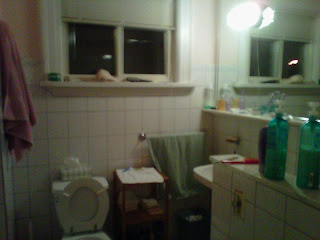
It's pretty nasty. The finishes are old and the layout is funky. I'm working on getting the layout sorted out since it's so awkward but I decided to put together an inspiration board.
First of all, I'm obsessed with the Kohler Brockway sink.
I. Must. Have. It.
I first saw it several years ago in Style at Home Magazine. I truly love this bathroom - it's so family friendly and casual. Perfectly classic and something I'd never get sick of.
Recently, I also saw the sink featured on this blog. I recommend the house tour. The home is simple country: classic, elegant and slightly quirky. I look that I love. I also really like the black painted bottom of the sink. I'm not sure I could go as high colour as the teal turquoise above.
I'll post later about the bathroom layout - when I have some better before shots that really show how awkward it is. For now, here's my inspiration board:
Sources:
The tile is from Olympia Tile. I'm doing the hex on the floor with a banded edge of black 1x1's. The subway is for the walls and the area around the clawfoot tub. I want it to have a rain shower head and circular curtain made of the Schumacher fabric. Coincidently, I'm also looking for a fabric with a similar feel in a more affordable price range (but boy, do I love that fabric!).
It will look something like this:
I wish I knew this source: let me know if you can help
The Brockway is Kohler and the light is from Barn Light Electric. I am still debating the black matte finish or something with colour. I'm also still debating wall colour as I need to firm up the decision about the fabric first.
What do you think?
Meg


No comments:
Post a Comment