Tuesday, May 31, 2011

In the Interim...

Ah.. the kitchen in the new house.  I want to tell you it is going to be okay but alas, I cannot.  It is fugly.

 I'm talking faux veneered wood cabinetry, peel-n-stick checkerboard tile flooring and no dishwasher.  I also want to tell you that the kitchen is in the budget for the first phase of renovations.  But it isn't.

This is for two reasons.  First of all, the house needs top to bottom renovation.  Everything needs to be stripped of 80s wallpaper, cracks repaired, crazy trim replaced, re-painted, etc.  That much work is costly.  Since we  own a reno company, we will be working on the project ourselves, so there simply isn't enough time to do everything all at once.

   The second reason is that I really feel you need to live in a space like this one before you commit to a major project like the kitchen.  That way, you can figure out how the space flows and how you will use it.  This part of the house will require some structural changes and it looks like the kitchen is going to be a down-the-road phase.

So, what to do in the interim?  It's hard to live with that kind of fugly.


Here's my plan:

First:  The cabinets are very dark and not in the best shape. They have white plastic handles. I'll paint the bottom cupboards pale grey-brown and replace the handles. I think I'll remove the upper cabinet doors and create some crisp, white open shelving, like this:


We have some cool antique corbels that we bought at an antique market.  Right now they're painted blue but I think I'll paint them white to go with the upper shelving.  I really like this one too:


The backsplash is currently hexagonal floor tile - like what you'd see in a vintage bathroom.  We might leave it for now, since it's white and you don't really notice that it's floor tile.  But I also think chalkboard paint would be a good solution.  I like how the graphic black paint in the above photo sets off everything on the shelves.   
   One thing I will be using chalkboard paint for is the refrigerator.  


I think I will use a grey paint though.  I love that you can just write your shopping list down on the front of the fridge!  I know the kids will really enjoy it.  Here are some colours I'm thinking of:

BM Amherst Gray - for the lower cabinetry


BM White Dove - for the shelving, corbels and upper cabinetry

Still searching for the right fabric for the roman shade.  I also need a small wooden table and chairs to set against one unused wall.  The kids can eat breakfast there.  Perhaps a trip to Aberfoyle is in order!!!  I'll keep you posted on the project.

Meg

Monday, May 30, 2011

What Makes You Happy?

I'm having a crappy day.  I feel bummed and down in the dumps so I thought I'd post a few spaces that just plain make me happy.

  There is something inherently pleasing about country living and decorating.  It's casual and simple and fuss free.  I think we all could do with a little less fuss sometimes.


I would sit in this breakfast nook with a coffee and a book.  
I love the orange and aqua and the chippy old lamps above the table. 
 It would be a very happy place to sit in all the sunshine streaming in from the windows.


This casual bedroom would be a perfect serene place to lay your head.  I especially love the black sconces - they add that graphic punch to the room.

How could this kitchen not make you happy?  The dark, dramatic cabinets are offset by the marble counter and backsplash - making it a perfectly neutral space to add your own accent colour.  Yellow is the colour of sunshine and lemonade, which makes it happy all on its own.  Also, the black windows and hit of wood in the corbels over the range are perfection.  love.

So, what makes you happy in your home?  

Meg

Saturday, May 28, 2011

Storage Solution

After the final visit we just had at our new house, my husband, Jay, and I were discussing the bathroom.  I'm pretty sure I mentioned that I am obsessed with the Kohler Brockway sink.  I reallyreallyreallyreally want it.  To me it has a laid back farmhouse aesthetic that would make the room.  I love the open, airy quality and that you can paint the bottom of the basin in a fun colour (although I am more likely to go with grey or beige cause that's just how I roll).

That's a whole lotta love for a sink, isn't it?

So when Jay and I were looking at the family bath at our new house, he says,"Where are you girls gonna put your hair things?"

Our hair things?


He means, "What about storage?  We don't have any storage if we install a sink like that instead of a traditional cabinet." And he's right, there really isn't any other place to put hidden storage in this bathroom.

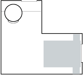
I should say, this bathroom is not big.  And it's the only full bath in the house until we build the master ensuite during phase 110 of the 'new house project'.  So 4 of us will share it until that time.  The layout is something like this, the grey rectangle being the sink.  No, I'm not an expert layout artist...


So I can put in the Brockway... or perhaps something like this (which has storage and good looks):

Pottery Barn Vanity
This would be the vanity inspiration, Jay would actually build it (I love having a carpenter for a husband) and I would pick a slab for the top.  Most likely a cararra slab cause I love cream and grey. I like the turned legs and the shelf at the bottom that is open for baskets or towels.  And I would put a high goose-necked faucet on there too.
  Oh yeah, and he doesn't like the Schumacher Fabric I picked either.  Perhaps plain natural linen would be better.  You know, simple.

"Can I at least have a cool rug?"


Blueberry Striped Rug

How about this one from Dash & Albert?  Then I can paint the walls a battleship grey colour.  

BM Amherst Grey
I guess the bathroom is still a work in progress.  Any thoughts on the storage debate?

Meg

Tuesday, May 24, 2011

Does Your House Match Your Outfit?

Ever notice how the style of clothing you gravitate towards is similar to the style of your decor?  Lately, i've been spending a fair bit of time on Pinterest.  Perhaps more time than I should... And what I've noticed is that the 'My Style' Pins correspond to my 'For the Home' pins.

I really lean towards classic clothes that are simple, tailored and casual.  I like to invest in nice quality for certain items, like a great winter jacket or handbag, or even a pair of jeans.  But other items I buy on the cheap, say layering pieces like t-Shirts or tanks in fun colours.  But basically, my daily wardrobe consists of jeans, a tank or tee and a cardigan.  These boards from pinterest reflect my fashion style:


So, since I dress myself with neutral, casual, simple clothing, I should probably also surround myself with a neutral, casual, simple space.... right?

This approach makes sense to me.  I've often seen dressy, formal spaces in magazines that I love the look of but I just don't think I would be able to live with that for the long run.  I don't really buy in to trends, sticking with time honoured classics that I won't tire of quickly.  These spaces from Pinterest are classics:


But you will notice that these spaces aren't completely neutral.  There are pops of colour and pattern for interest.  Sort of  like my wardrobe.  Makes sense, right?

Meg

Monday, May 23, 2011

Audrey's Room

On Friday, we went on our final visit to the new house before we take possession.  We walked through the space and did some measuring and planning.  As a result, I have re-thought the bathroom project.  I'll post more on that later.  For now, some ideas for Audrey's space.
     Audrey is seven.  She loves all things girly and spends lots of time in her room - crafting, writing, reading, playing and dancing.  She is up there a lot doin' her thing.  I really want her room to express her personality.  She loves colour and pattern and *stuff*.  I want her room to reflect that.  The only thing is - that would make a pretty busy, loud room and my general decorating style is more neutral and subtle.
  I'm trying to find a way to blend our two styles and make her a room she loves that still fits in with the rest of the house.
Above is the general layout of the room.  It is uniquely shaped and will offer two zones.  The bed and night tables will fit perfectly into one nook.  In the other nook, we plan to create a window seat built-in.  This will give her a comfy place to read and craft.  I'm thinking of lots of pretty pillows and a custom shelving unit to house her supplies.  I'm not exactly sure how that's going to fit into the space but since Jay is a carpenter, he will make it work for us.

the old quilt from PB Kids

Right now, Audrey has the Pottery Barn "Audrey" stuff in her room.  She used to love lavender and her room reflected that.  Her latest colour love is turquoise, so we'll be making some changes to her stuff.  Here are some inspirational shots.  Please forgive me, I don't have the sources for a couple of them.  If you know the source, email me so I can properly credit them.


I love how this room is grown-up feeling.  The raspberry colour is awesome and the space feels like it would grow with a girl.

Believe it or not, this is a nursery!  I love the soft colours and the mature feeling of the space.  Also, a chevron rug will be making its way into Audrey's room.


This room is the colour inspiration for Audrey's room.  I love so many things about it.  The turquoise metal bed, the raspberry table, the ric rac trim on the delicate roman shades...  I am hoping to use some similar colours and achieve the same feel.
  So, I'm on the hunt for the fabric to use as a jumping off point.  I'll post about this again when I have a mood board to show you!

Meg

Friday, May 20, 2011

Check Me Out!!! I'm Featured!!!

I know, I know... this happens to other people in the blog world a lot.

But I'm new around here and it's my first time.

My new house is featured on Michael Penney Style, in his Ask Your Friendly Neighbourhood Decorator section.  If you don't follow his blog, it's awesome, and you should.  He's a Canadian magazine guy with brilliant DIY ideas and a fresh traditional aesthetic.  The home he and his wife, Sara, recently bought was featured in the current Canadian House & Home Magazine.  Go take a look... it's amazing!

Meg

Saturday, May 7, 2011

The Family Bath

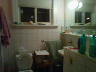
So, just so you know the state of the house we are starting with, here is what the upstairs family bath looks like now.


It's pretty nasty.  The finishes are old and the layout is funky.  I'm working on getting the layout sorted out since it's so awkward but I decided to put together an inspiration board.

First of all, I'm obsessed with the Kohler Brockway sink.

 I. Must. Have. It.

I first saw it several years ago  in Style at Home Magazine.  I truly love this bathroom - it's so family friendly and casual.  Perfectly classic and something I'd never get sick of.


 Recently, I also saw the sink featured on this blog.  I recommend the house tour.  The home  is simple country: classic, elegant and slightly quirky.  I look that I love. I also really like the black painted bottom of the sink.  I'm not sure I could go as high colour as the teal turquoise above.


I'll post later about the bathroom layout - when I have some better before shots that really show how awkward it is.  For now, here's my inspiration board:


Sources:
The tile is from Olympia Tile.  I'm doing the hex on the floor with a banded edge of black 1x1's.  The subway is for the walls and the area around the clawfoot tub.  I want it to have a rain shower head and circular curtain made of the Schumacher  fabric.  Coincidently, I'm also looking for a fabric with a similar feel in a more affordable price range (but boy, do I love that fabric!).
It will look something like this:

I wish I knew this source:  let me know if you can help

The Brockway is Kohler and the light is from Barn Light Electric.  I am still debating the black matte finish or something with colour.  I'm also still debating wall colour as I need to firm up the decision about the fabric first.
What do you think?

Meg

Thursday, May 5, 2011

The New House

    So, if you've followed me over at Duchess & Howard, you will know that my husband is a contractor with a renovation firm in London, Ontario.
  We've had a really busy year this year.  We have bought, worked on, and sold a flip house with our partners Aron and Tracey.  We did all the work ourselves and created an amazing home for someone else to live in.

Now it's my turn.

Our current home, in Wortley Village, is for sale:

   That's because we have bought a new house!  We are moving to a home I have dreamed of living in for a long time.  In fact, we tried to buy the house from the little old couple who currently live there three years ago but they weren't ready to sell.  Then, in December, a little sign went up in their window!  'House for Sale by Owner'!  I was so excited but I didn't think Jason would be on board.  He surprised me by being completely ready to jump.  Even though the house we live in now is great and it has almost enough room for everything we need.  Almost

So, why do I love my new house so much?  Here it is:


   There's an intangible quality there... that certain something.  It has great bones, high ceilings, leaded glass and beefy trim.  It's an older home also but has a decidedly different, unique architecture than any other home in the neighbourhood.  Most of the houses are in the style of our current house.  I guess there's a certain charm to that - to being unique.
  And... the inside is a total mess.  That means we get to plan and reno the home and create exactly what we want.  That's the part I'm most looking forward to.
  So for now, I'm working on the design of my new blog along with washing windows and vacuuming and dusting to get ready for our open houses this weekend.  Watch for the next post about the very first renovation we are doing!

    Meg