Showing posts with label living room. Show all posts

Friday, April 1, 2016

Scenes From A Renovation, Part II

Although these pictures are a disaster, much progress is happening on our renovation! The kitchen window has been replaced with a much smaller window.  I know this might seem like a bad idea, and in some ways it is, but it allows us to actually have both cabinetry and open shelving.

Here are two shots of the kitchen, first with the old larger window:


And then with the new smaller window:


I will admit that when I walked in to see this little window I had a panic attack. Who makes their windows smaller, anyway? But Jay reminded me that to the right of the window there are cabinets and to the left of the window there are open shelves.  These shelves were on my absolute must-have list for our kitchen and something I've always wanted. We are also considering replacing the working window with a fixed glass pane so that it's less busy there. It seemed important that we be able to open the window above the sink, so we're going to live with it this way for a bit and see.

You can also see that we opened up the wall where the stairway goes down to the lower level. The light blue door will be replaced with a full glass garden door, meaning plenty of light, and a pretty sight-line into the backyard will be visible to the space.


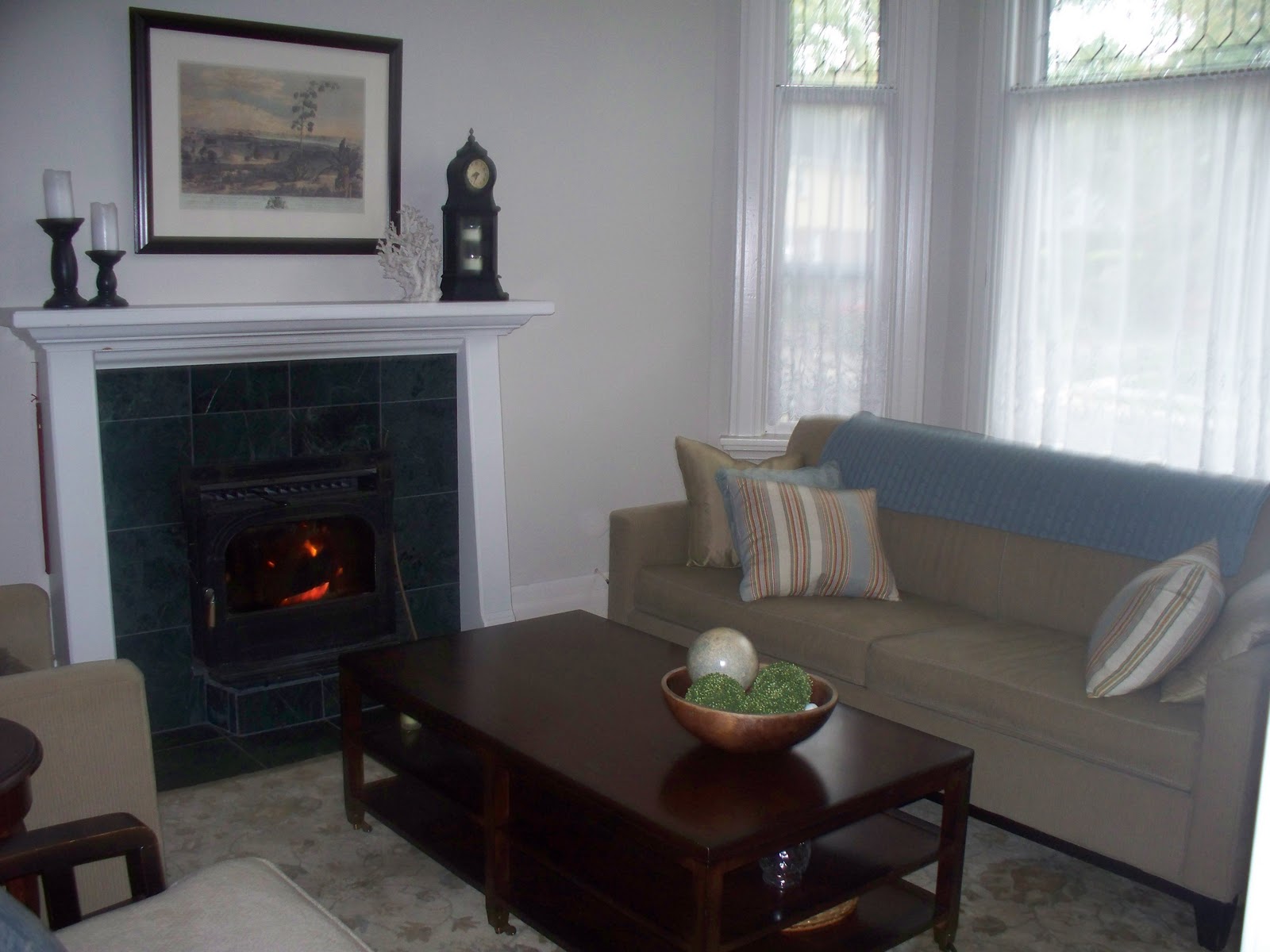
On the other side of the space, in the living room, the fireplace has been chipped out. We will be moving the fireplace surround a couple feet to the left, so that it is centred on the wall with built-ins on either side.  Honestly, this fireplace has made furniture placement near impossible in the room and just needed to be moved. This portion of the project may come in phase two, since the flooring has eaten up more of our budget than we anticipated. In the meantime, the gas will be moved to the appropriate spot so that when we're ready to finish this part, we can move forward easily. 


Counter-top selection, and cabinet colour sample in actual space
Then we picked up a drawer front from the finisher so we could see how everything looks together.  I looooove it. It's a bit hard to tell the colours in the iphone pic below since it was poor light when I took this quick shot this morning.  There is actually much more contrast between the counter selection and the cabinet doors.  Things are looking a little on the 'cooler' side so I'm hoping the wood floors and shelving warm things up a bit. 

Counter samples, wall colour and actual drawer front 


So things are still moving forward. Decisions are being made about finishes! Also moving forward this week are:
  • wood floors ordered (oak with stain colour to be determined) and installed
  • electrical plan rough-ins are installed for pot lights and fixtures in all the rooms
  • drywall has gone up on the ceiling and walls


Still lots of work to do, mess to clean up and decisions to be made!

Meg


Monday, March 24, 2014

Chair Options

My hubby would say that I'm obsessed with fabric choices.  I would probably agree. I'm working on the fabric scheme for our living room.  I'm trying to figure out a plan for my vintage cane chairs.  So there's been a whole lot of:

"Do you like this one?"
"Yep.  That's nice."
"How about THIS one?"
"Yep.  That's nice too."

I figured you guys would be more interested in my fabric decisions.  So here they are.  I'm deciding between the two accent fabrics, and assorted upholstery fabrics.  The chairs will be sprayed white, I think BM's White Dove most likely.  Also, the rug is new, so it's staying.  There will most likely be a white slipcovered couch.


Jason would be so grateful if you guys could weigh in so that I can stop bugging him about this.

I need to know!  Do you like the Chaing Mai or the Ornate Pool as the accent pillow fabric?  Which upholstery fabric do you like? Yes, #1 and #4 are the same fabric.  Is that a sign?

Hope you're having a good Monday!

xo Meg

Wednesday, February 6, 2013

Progress


Ok people, let's talk progress.  I can only talk progress because nothing is anywhere near an 'after' shot yet.  We are in process, but some of the changes have already made a huge difference to me.  

Take for instance, this boob light that hung over my dining room table.  

Why a boob light over a dining room table??? 

I have no idea.


     This is the light I grabbed on sale at Wisteria.  The scale is really great for the small dining room and it has a really pretty patina that you can't really see in these iphone shots.  In the above photo, you will also see a white paint sample painted next to the window.  I can't wait to paint out the entire room in BM White Dove, my all time fave white.  


     Next up, the front window.  This one is really hard to photograph, since it is a 10 foot window with tons of sunlight streaming in.  There were *fugly* vertical blinds hung here.  These blinds were a serious kind of gross:  dirty, greasy, dusty and disgusting.  


If you recall, I have some beautifully sewn, amazing curtains that I was planning to use here.  I knew they weren't wide enough for the 10 foot window, but I was hoping to add a plain white linen curtain panel to each side to fill it out and cover the window.


I tried it and it looked terrible.  

You know, like I cheaped out on the curtains.  Not the look I was going for.  So I had to revise my plan. I'm going to find a new home for the patterned curtains that I love so much and just use white linen panels in the living room.  This also frees us up to use a new colour palate in there as the fabric was pretty bossy.  

So, I'm left with a single white panel on each side of the large window.  It doesn't have the fullness that I'm looking for, and isn't even hemmed yet, but it offers some privacy until I can add two more panels.


Basement work is also progressing.  Elliott's room and the family room are framed, insulated and vapor barrier has been installed.  Next up:  drywall.   My hubby rocks.


xo Meg

Thursday, July 26, 2012

Trim Repairs & Help in the Bedroom

Thanks so much for all your great ideas about my bedside tables!  I really appreciate your input here, since hanging artwork is really not something I feel comfortable with. 

I loved Casey's idea to switch the large horizontal photographs with the smaller pieces and most of you did too.  Unfortunately, I use the plug behind my bedside table all the time for my laptop, phone, etc.  so I can't just lean the picture up against the wall.  But I will try switching the large and small pieces to see how that looks. 

In the meantime, I'm still working away at the projects we are currently doing around here.  Mainly, I'm prepping the old, beat up trim in our house for a fresh coat of paint.  We're using BM White Dove on all the trim and cabinetry in the house.

I don't want to brag or anything... but I'm kind of a trim jedi master. 

Seriously.   I am currently working on the trim in the living room:  baseboard, crown molding, window and door casing.  It is all original to our 120 year old house so it has seen better days. 

Really, really hard to get a decent photo of this window because so much
light filters in here.  This is an old one 


The trim around our leaded glass bay window is in very bad shape. 


nasty trim before


nasty trim filled in with latex caulking (sorry for the blurry iphone pics)

Right now, I have all the trim in this room caulked and filled.  I use a combination of latex caulking in a caulking gun and Durabond filler.  I'm waiting for everything to dry and cure and then it will all get a coat of White Dove.  I can't wait to show you how nice it looks once it's all freshly painted.

In the meantime, I'm going to head upstairs and put a couple more holes in the wall around our bedside tables!


xo Meg

Thursday, October 27, 2011

Designer Crush: Massuco Warner Miller

I first discovered Massucco Warner Miller when I searched the source of this photo:


I'm sure you've all seen it, since it's typically all over blogland and is the inspiration for many little girl's rooms.  I love this room - it's fresh and classic, graphic and colourful.  But it's not over the top.  It strikes a perfect balance.

There are so many beautiful spaces on the MSW site.  They are all so well decorated. But what is it that I love so much about them that keeps me coming back?   I'm always trying to pin down my own decorating taste and define my style.  

I think some of it lies in the details.  There is no design element left undone. 


I'm not sure this room really reflects my style but I love the repetition: pairs of mirrors, lamps, consoles, stools, chairs...etc.  The symmetry is really remarkable.  The fabrics are also stunning.  


Maybe for this one, it's the simplicity that gets me.  Or the pairing of rust and aqua, which is always a favourite of mine.


This is just a dream girls bedroom.  I love the lines of those sculptural side tables and the unexpected pop of mustardy yellow.  It keeps it from being too saccharine.  Also, the white painted stone is killer.


In all these spaces, the firm has used really fine fabrics.  I'm interested to see if I can create a 'look for less' version of this homework room for my own office.


Here's a more formal dining space with unbelievable wallpaper and chocolate ruffle curtains.  
 Just so good.  

I hope you enjoyed this glimpse into the MSW portfolio.  You should really go to their site and check out all the homes featured.  They are pretty remarkable.  

xo Meg

Note:  All photos via Massucco Warner Miller.   

Monday, September 19, 2011

Living Room Art

What a lovely weekend we had here in London.  Sunny and crisp, perfect fall weather.  Unfortunately, Jay worked most of the weekend again but we did manage to have some friends over on Saturday night.  We also went to a Native Harvest Festival and PowWow on Sunday.  It was beautiful and I'll share more about that later in the week.

I bet you're wondering about my art installations!  I managed to put up the artwork in the living and dining rooms at least.   I didn't chicken out.  I put holes in the plaster.


Here is the piece we got on a trip to Cuba in 2005.  And my mantel, looking decidedly un-fall-ish.  But I'll get to that sometime soon.  


     I also re-arranged the room.  If you recall from this post, the couch used to be where the series of three paintings is. I think I like it better this way for now.  We've been enjoying our wood -burning fireplace a whole lot this fall and this set up allows better views of the fireplace.  In the past, we've only had gas fireplaces.  I always thought I wouldn't like the wood burning type since they are messier and smokier but I really love it.  


I still think the room needs more personality but I'm starting to really feel at home in here.  Maybe it's the fire.  Alice the kitty sure is enjoying it too.


I have so many things to share with you this week.  I'd love some feedback on the new living room!

xo Meg

Monday, July 18, 2011

The Duchess House Chronicles

     I'm feeling so overwhelmed by the new house.  There is so much to do that I don't even know where to start.  I'm constantly devising a new plan for this or a new approach to that but the truth is... until I get all the boxes emptied out and put away, I can't really get down to the fun stuff.

    So today I'm starting a new series.  I'm hoping this will break down this insurmountable house into smaller, more manageable portions.  Portions that I can tackle and complete and feel like I have actually accomplished something.  Baby steps, right?

    You will probably also notice some changes to the blog over the next few days as well.  I am adding some tabs at the top to make things easier to navigate and organize my reno so I can really keep track of the progress.  After all, this is supposed to be a journal of the progress of this house.  So,  I give you...


   Just a reminder, we just moved in, half our stuff is still in boxes and this room is no where near decorated much less styled!

   This is the front living room at our Duchess house.  It has a bit of an awkward layout.  We have been working on arranging our existing furniture but are discovering that it doesn't really fit into this room.  Everything in the room feels off centre to me.  I am the kind of person who re quires symmetry.  I like pairs of things:  lamps, chairs, etc.  So I'm having a really hard time getting my head around this long, skinny room.

This is the planned layout:


   I don't really love the rug I have with the fabric in the adjoining dining room.  I think a nice sisal rug would look better.  We will move the Pottery Barn rug that is currently in there up to our master.


I found a couple chairs I like at Urban Outfitters.  They are both small in scale but I need to decide how much pattern I want.  The striped cushions and the orange velvet cushions will stay.


There is also the question of lighting.  I would like to put a couple of sconces on either side of the fireplace.  I haven't sourced them yet but there is no light in this room except for the plug-in lamps.


We hate the fireplace, especially my carpenter husband.  He will eventually restore it.  There will be pretty millwork that goes with the style of the home.  There will be no green faux marble tile. The artwork will all get hung and the mantel will be styled.


  I love the bay window with the leaded glass.  I am just going to make simple sheer linen cafe curtains for here.  The lace ones aren't really to our taste but they aren't an immediate priority.

   There you are, a snapshot of the first room you see in the house.  The others are in even worse shape and I'll be showing you my plans for those over the next couple weeks.

xo Meg